
Parts Website Navigation 101
Making the navigation on your website easy to use seems like a no-brainer – you link to the “stuff” you want your users to find in the main menu, then you just assume your users will find it and everything will go to plan.
Unfortunately, website navigation is actually quite difficult. Helping your customers find the “stuff” on your website isn’t about listing the pages you have: It’s about listing the content consumers are looking for, and making that content easy to find. If your website’s navigation isn’t easy to use or understand, it can severely hamper your site’s performance.
While there are no hard-and-fast rules for making the perfect website menu, we’ve compiled some basic tips and best practices here to help you review what have on your site currently.
Make A Plan
The biggest mistake that website developers make is to design the menu around the site content, rather than plan the site content around the menu. The website owner tells the developer “I want people to be able to find all our parts using the main menu.” The developer looks at how the parts are organized (probably by category), then puts those categories in the main menu.
The problem: Not every part category (or page of content) belongs in the main menu. Some categories are too specific or limited to be included, while others are too broad or general to be useful.
We’ll be honest and say that organizing auto parts into a menu isn’t easy. There is no one-size-fits-all solution. But it’s a good idea to watch how your customers shop your current website, what they’re clicking on, etc., and develop a new menu accordingly. If you find that people aren’t clicking on certain menu options – or are clicking on specific items and then dropping off the site – odds are good your menu could use a tune-up.
Keep It Simple (and Test)
Many ecommerce sites have a menu across the very top of the page, then another menu below the header, then a few menus in the footer, and very often a menu along the left side of the design. That’s a LOT of menus, and sites with too many menus can be overwhelming and potentially confusing to your users.
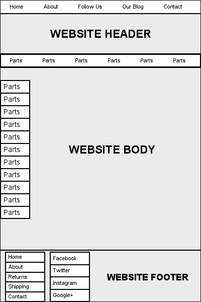
The wireframe above shows how many menus a parts website can have if you don’t think about simplicity. Generally speaking, ecommerce sites should have just enough menus to do the job, and not one menu more.
If you’re not sure as to whether or not your site is complex, test it. A/B testing might be an option, as would usability testing.
Follow Menu Conventions
There are some conventions in web design that – good or bad – are used often enough that you should model them in your menu. For example, users are accusstomed to looking for the following links:
- Home
- About
- Contact
In your main menu. If you have an ecommerce site, it’s a good idea to use a footer menu as well, and very often the footer menu contains links to things like:
- A privacy policy
- A “terms and conditions” page
- Links to shipping policies, return policies, FAQs, gift cards, etc.
Use Breadcrumbs
Just like in the fairy tale Hansel and Gretel, a breadcrumb trail is a path back to the original point. On a parts website, a breadcrumb reveals the user’s location on the site relative to the homepage.
For example, a breadcrumb might look like this:
Home > Suspension Parts > Lift Kits > Superlift
If your content management system allows them – and if you’re utilizing categories to organize your parts – breadcrumbs are a nice feature:
- They make it easier for users to confirm that they’re on the right page
- They help users find the page they want without having to use the main menu
- Most importantly, breadcrumbs help to reduce bounce rate by tempting users to click on higher level pages to view related areas of interest.
Use Easy, Structured URLS That Match Your Menu Structure
This is a pretty straightforward tip: Make your URLs easy to “read” so that users can look at them to see where they are on your site. This means your URLs should be short, should contain keywords that your users understand, and they should be ordered logically (just like your main menu).
Additionally, if your URLs are easy to understand, people are more likely to click on them when they see them on a forum or in an email…we’ve all clicked on links that looked like gibberish and had a bad experience. Finally, a nice clean URL is easier for people to remember if they have to type it in for some reason.
Create Two Sitemaps
A sitemap is a roadmap for websites. For easy navigation, two site maps be should be created:
Search Engine Sitemap
Sitemaps made for search engines are extremely important as it allows site owner to tell search engines what pages are available for crawling. This helps search engines index your content since you can inform them where everything is located.
In the simplest form, a sitemap is document which lists all of the URLs on your site. It details information like when the page was modified, how frequently a page has been changed, and which pages should get priority.
Visitor Sitemaps
Creating a sitemap for the human users is just like making any other page. A link to the sitemap should exist with the primary navigation or site’s footer — it should be easy to find without too much searching.
A visitor friendly sitemap should be laid out as follows:
- A heading, layout, and brief overview. This is especially important should someone land on this page directly from a search engine.
- Text links and descriptions. The visitor’s sitemap should use primarily text links and shouldn’t be cluttered with images or graphics to distract.
- It should be current. Make sure to update your sitemap as needed to add or remove pages currently on the site.
These techniques are proven to help make your site easier to navigate. Use these easy tips as a part of your overall site content and design planning. Easy navigation is vital to the performance and effectiveness of your parts site, so don’t underestimate it’s importance.
More Content

One of the keys to selling auto parts and accessories online is trust. Trust comes from a strong brand, a nice-looking website, and lots of…
Read More
If you are creating a new website or reconsidering your existing domain name and hosting arrangement, this post is for you. We cover the basics…
Read More
Auto parts and accessories manufacturers and retailers that advertise need to understand return on ad spend (ROAS). In this three-minute video, Spork Marketing Founder Jason…
Read MoreSUBSCRIBE
We'll send you actionable parts and accessorries marketing articles every month - just sign up below.
